The kitchen tablet: a wall dashboard I actually like looking at
A custom Home Assistant dashboard on a Samsung tablet. Black screen, one warm colour, everything readable from across the counter.
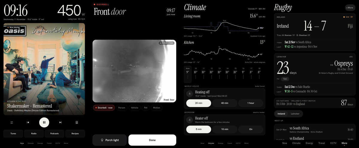
A custom Home Assistant dashboard on a Samsung tablet. Black screen, one warm colour, everything readable from across the counter.
I wanted one screen in the kitchen that tells me what I need to know without me touching it. Not a phone-sized grid of toggles, but something designed to be glanced at from 60 cm away while holding a kettle. This is that screen: a Galaxy Tab A9 running Home Assistant, with a dashboard I designed and built from scratch.
It's a music player first
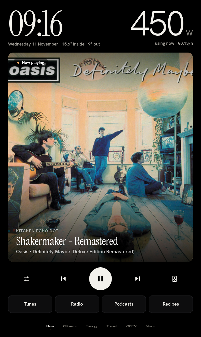
The home page is the clock, the electricity I'm using right now, and the album art, as big as the screen allows. When nothing is playing, the art doesn't go blank. It slowly crossfades through my most-played albums, one every fifteen minutes, so the kitchen always looks like a record shop.
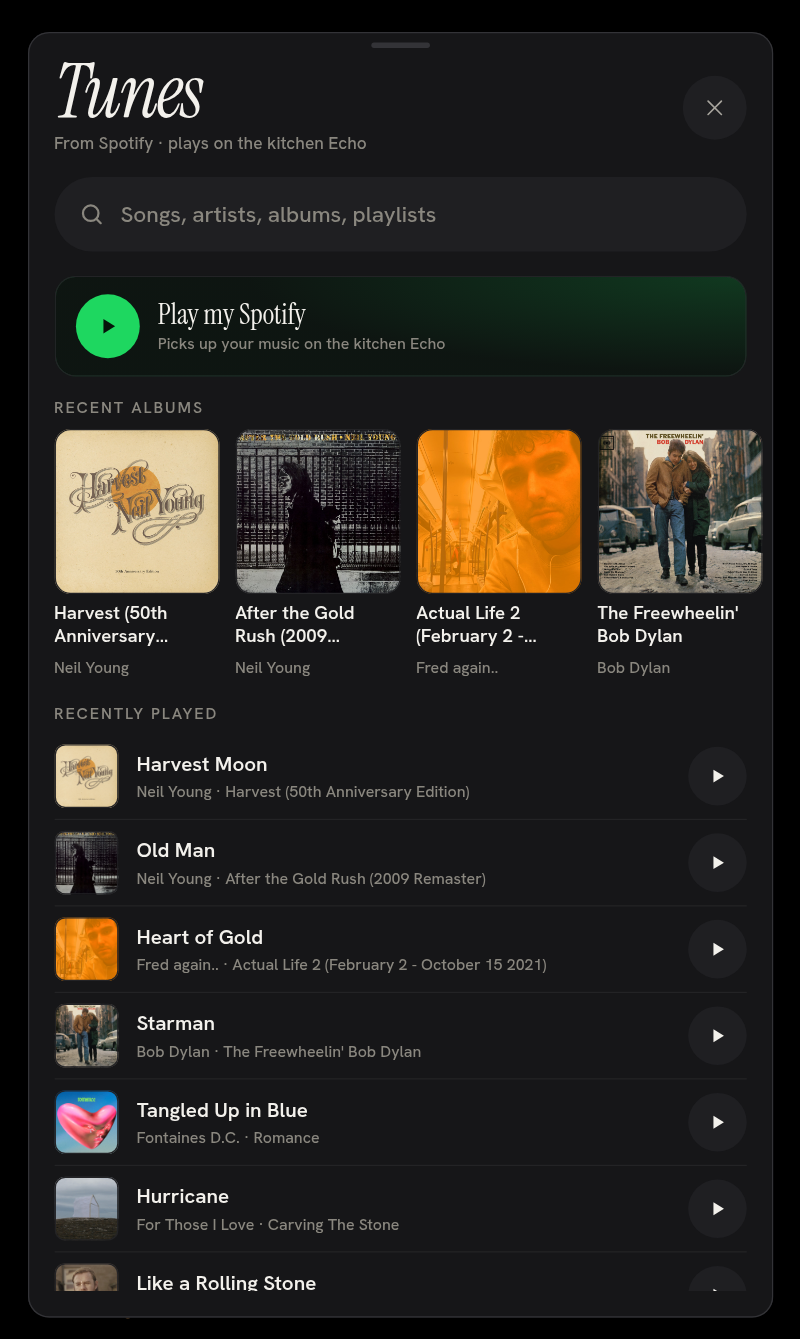
Tap Tunes, Radio or Podcasts and you get my own take on a Spotify interface, built on the Home Assistant Spotify integration. Search anything, pick up a recent album, or hit "Play my Spotify" and it starts on the kitchen Echo. No phone, no app, no hunting for the right speaker.
The doorbell takes over the screen
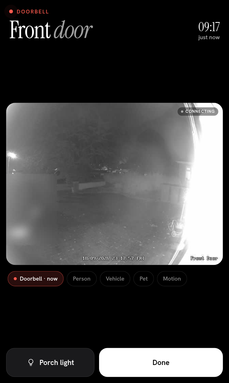
When someone rings, or the camera sees a person at the front door, the whole tablet becomes the front door: live video, who and when, a button for the porch light, and a big Done. It wakes the screen and closes itself after 90 seconds. There's no pill, no notification to tap, nothing to find. You just see who it is.
Climate and energy
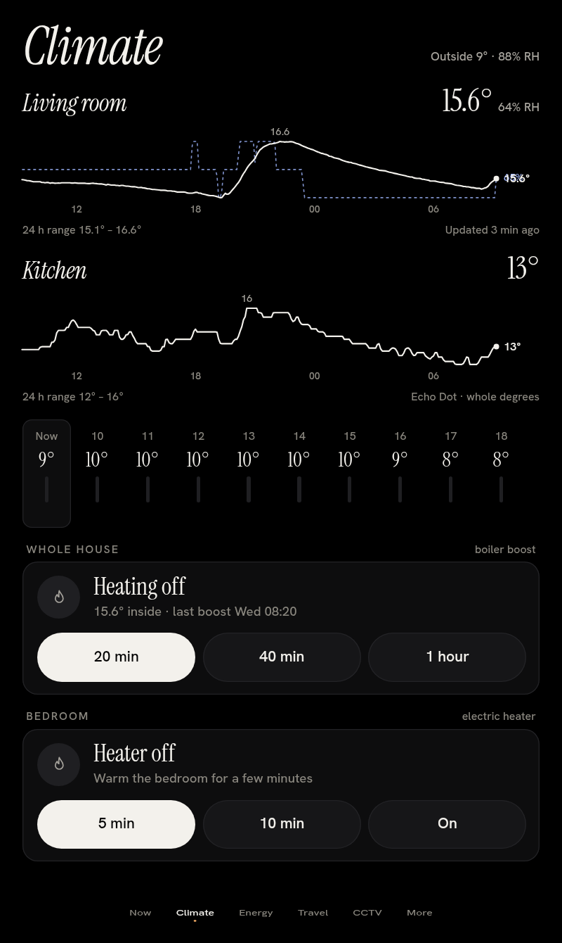
Climate shows the living room and kitchen temperatures over 24 hours, the next ten hours of weather, and the heating controls. The boiler has 20-minute, 40-minute and 1-hour boosts, and the bedroom electric heater has 5- and 10-minute ones, each backed by a timer plus a watchdog that switches it off however it got turned on. I did not want to find a heater on at 3am.
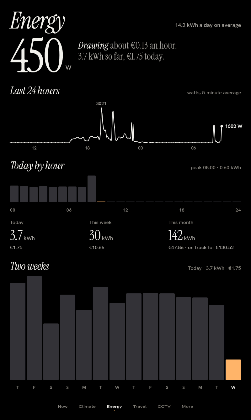
Energy is the one I check most. The big number is watts, right now. Underneath: the last 24 hours, today by hour, and this week and month in kWh and euros, with a projection for the month. Tap any bar to drill into it.
Travel: when to leave, not when it leaves
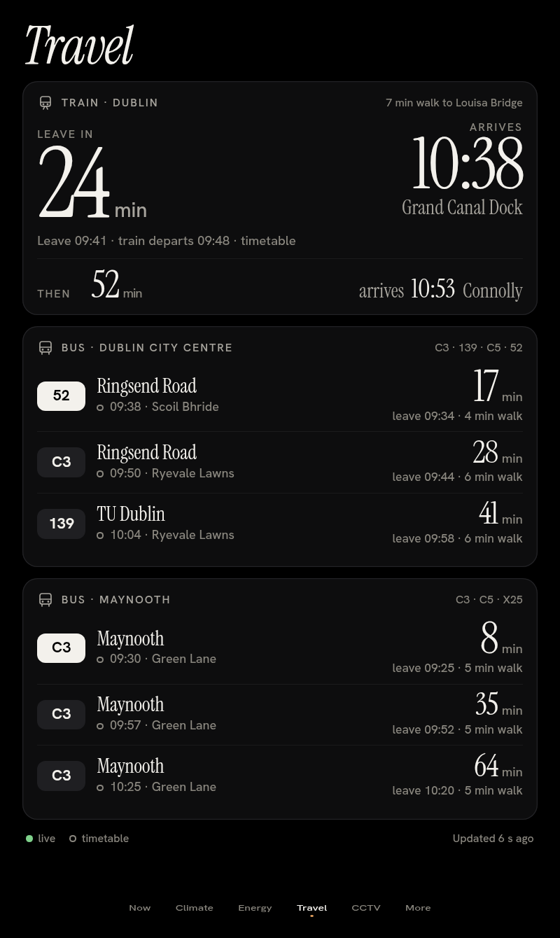
Timetables tell you when the train goes. I want to know when to put my shoes on. The Travel page takes live Irish Rail and bus data, subtracts the walk to the stop, and shows one giant number: leave in 24 min, with the arrival time next to it. The train after that sits smaller underneath, and the buses to the city and to Maynooth are below.
Rugby, for two teams only
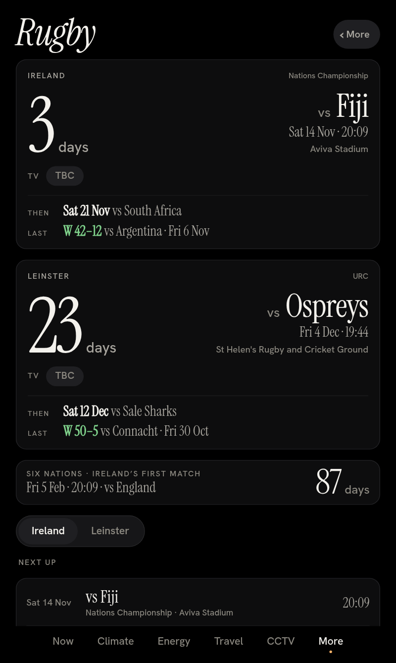
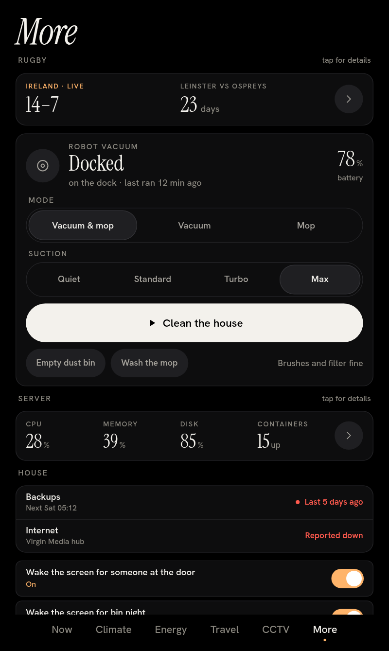
Under More there's a rugby page for Ireland and Leinster and nobody else: a countdown to each next match with kick-off and venue, live scores during games, the last result, upcoming fixtures, and a countdown to Ireland's first Six Nations match. The TV channel is honest: if the official sources don't publish it, it says TBC rather than guessing.
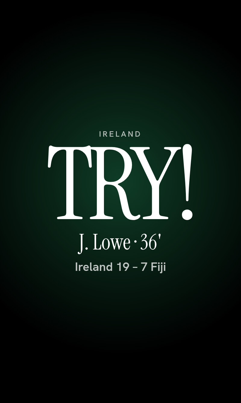
And when Ireland or Leinster score a try, the whole screen goes TRY!, with the scorer and the score. Never for the other team. No sounds, no flashing lights, just a big word and the kitchen going quiet for a second.
And the rest of More
The rest of More is the robot vacuum (clean the house, pause, send it home, empty the bin), the server at a glance, and a few settings. On bin night at 7pm the tablet pops up which bins go out, because the rotation is fortnightly and I never remember.
The design
A few rules kept it coherent:
- True black, and one colour. Black saves the screen and disappears into the wall. A warm tungsten orange means "on" or "needs you"; red is only for alerts.
- Big type, few words. Instrument Serif for the numbers and titles, Hanken Grotesk for the small text. Everything important is readable at arm's length; the small print is for people who lean in.
- Show the answer, not the data. "Leave in 24 min", not a timetable. "€0.13 an hour", not a graph you have to read.
- It leaves you alone. It returns to the home page after ten minutes untouched, dims at night, and only interrupts for the door, the bins and a try.
- Accessible by default. Text and controls meet WCAG AA contrast, touch targets are generous, and animations stop if the device asks for reduced motion.
Under the hood
It's a single custom card for Home Assistant, written in Preact with no build step and no runtime CDN: fonts and libraries are all served from the house. Home Assistant runs in Docker on a small server at home, and the tablet's browser is Fully Kiosk, which handles the screen and its brightness. The travel, rugby and server pages are fed by small Python scripts that run inside Home Assistant. The first real test of the live try alert is Ireland v Fiji on 14 November. I'll report back.